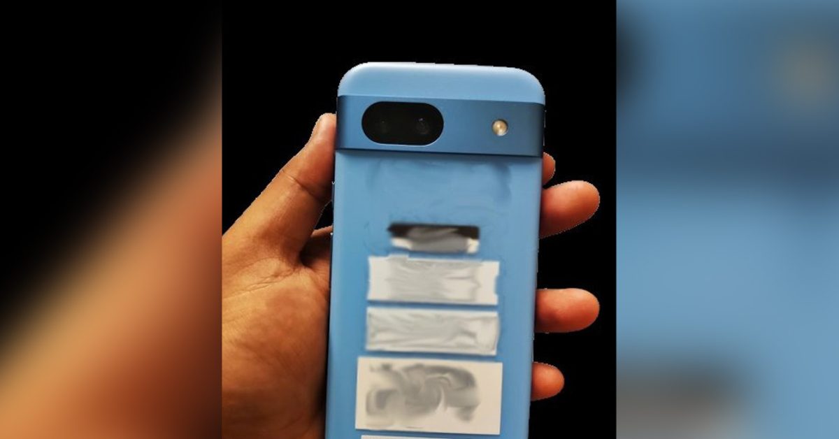
This looks dated in design to me, it looks like 2008 or so when everyone was experimenting with phone shapes and keyboards.
Yeah it looks like those cheap iPhones Apple released a few years back. The Xr?
The 5C?
That’s the one. Jesus, my sense of time passing is fucked up.
Yeah, shits fucked up. That was in 2013!! I remember my brother getting one in blue, it was a really pretty phone tbh I kinda miss them
They’re rounding it in the wrong plane. They should make it thicker, with a rounded back that flattens enough to sit without rocking. The Palm Pre, and the Nexus S and original Moto X were spiritual successors in my mind, was designed after how a river stone is pleasant in your hand.
Obviously the phone would have to be smaller, for that to work. But it would also allow a larger battery and flush camera.
The OG Moto X was probably the best feeling phone to hold.
I think it actually goes to the Pre, then Nexus S, and finally the Moto X. The Pre had it’s problems, largely the longevity of the slider mechanism and the side buttons (ignoring Sprint exclusivity and Palm dying). Mine died with the volume up button getting stuck on, constantly notifying me that the volume was at max. But it was essentially a fidget toy, I couldn’t stop spinning and flipping that thing. I think a big part of it was the thickness, around 16mm thick while the Nexus S and Moto X were around 10mm thick. Combined with the smaller size, it really was shaped like a river stone, while the other two just borrowed the sculpting to force into a different form factor.
So, we ended up with the Nexus S being a little bigger, and a little less sculpted. And then the Moto X was much more in the direction of modern phones, with just enough sculpting to make it nice to hold. Still tiny by today’s standards, and honestly, my ideal is probably somewhere between the Moto X and Nexus 5, with modern screen coverage ratios.
There hasn’t been any real form factor innovation in a very long time so cycling through the same styles is what we are left with.
Google Pixel 8a leaks
absurdlyearly with absurdly rounded designThis thing looks awful if real.
It seems they are cutting corners, literally.
That’s real ugly.
I do wish they’d stuck with the Panda look from the Pixel 2 for a while longer. It was much better looking than the visor.
But as far as “Google” phones go, the Nexus 6P was the best hardware they’ve had and they’ve not come close since.
I loved my Nexus 6P. That was a fantastic phone.
The panda look was not unique. I really enjoy the new look. I can tell when someone is using a pixel because the cameras stand out.
The rounded corners make it so ugly
Yea it’s a little too rounded.
Don’t get me wrong, soft edges are nice, but the radius needs to be brought in a bit tighter.
They tried to go for the iPhone approach but it just does not sit right with the camera bar. I love the way the current Pixel phones look because they have a very defined design with the squary shape and the camera bar.
I’m positive this is AI generated. I can’t believe 9 to 5 Google fell for this.
The ‘bump’ has a shadow in the two straight-on photos, but the side view shows no height.
The hands holding the phone give it away, too. The fingertips look softened from a filter and don’t have any sign of fingerprint ridges while the palm is much more detailed.
They also look too sharp in contrast to the background.
EDIT: The more I look the more I’m convinced. The side photo and the angled photo are completely different in size relative to the hand. The thickness of the palm is much too large, as well.
Damn. Didn’t notice this, but that thumb looks inverted.
I just want a phone with decent specs that lies flat on a flat surface. Why is that so hard???
You’d take a hit to camera quality. Get a phone case you wouldn’t have to worry.
I’d honestly prefer they just make the battery thicker to match the camera depth. Solve two problems at once.
I don’t care. And a phone shouldn’t need an accessory to be usable
Those are some durable corners. This will be way harder to damage or crack than the current narrower corners.
deleted by creator
I like it. Pity it won’t have a headphone jack and SD card slot…
Is there any chance it’s a compact (<6") size?
bezels are thick!
Woah I thought the A series was discontinued?
Why?
There were rumors earlier this year that said Google will discontinue a series.
Why would they discontinue their most successful phones?
Have you met Google?
Rounded huh that’s her. Going to look the exact same with my phone case on it… We don’t need one every fucking year Google


