
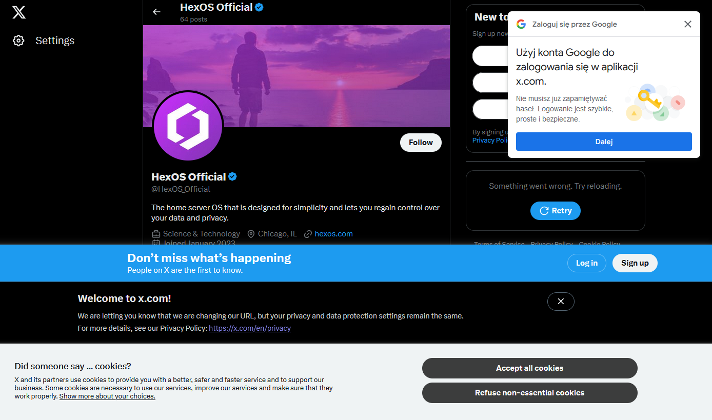
I happened to click a link that took me to the associated twitter X account for something I was interested in and was greeted by not one, not two, but four modern day web popups.
I know it’s nothing new. I’ve got a couple of firefox plugins that are usually quite good at hiding this sort of nonsense, but I guess they failed me today (or, I shudder to think, there were even more that were blocked, and this is what got through)
What’s the worst new/not-signed-in user experience you’ve encountered recently?
The different popups just show how bad design the web is today.
Ask cookie question is required.
Login? Always create an account and proceed with all signup questions.
Agreement? Read them 1 hour until you have understood everything.
Webbrowser: can I get your location? And please the mic and video too!
Finally, don’t forget the ads!
I one time for fun (cause I’m insane) read the entire Windows license agreement, MSA (Microsoft Services Agreement), and privacy policy. It took me 1 hour and 45 minutes, I timed it.
I could imagine they’d be interested in you over here: Tosdr.org
What a great site, I’ll definitely be sharing it with some (naive) friends and colleagues :)
Back on my Xbox 360 I decided to scroll through the agreement just to see how long it would take. I didn’t read it: I just held down the stick to see how long it would take.
I gave up after 40 minutes of scrolling.
That must be some slow scrolling
Thank you for your sacrifice
Wow. Is it even legal to have it that long?
I bet a lot was of details were missing in there as well.
Thank the European bureaucrats that don’t understand technology.
Sure, but can we at least agree that 800 “partners” is a tad too much?
Of course, the problem is they shouldn’t have gone for a warning, they should have gone against the practice of having 800 partners, or do we think the average user clicks “refuse”?
What they did is almost like nothing with extra steps.