that every panel is slightly different but featuring the same content(for example the “He” on helium is very slightly different in every panel, a regular artist would copy paste the text, not draw it every frame),
the font not being consistent(Look at the “E” in “HELIUM WALKS” and then the “E” in “WE DON’T”),
the absence of period symbols(Image Generation LLMs love to do this)
and the artstyle is very specific to other AI comics that are currently floating around the net.
On top of everything others have said, there’s no watermark, signature, url, etc from an original artist. Webcomics like this will always have one unless it’s removed by a reposter, which yeah, that happens, but I feel not as often these days. And when it does, it’s a pretty shitty thing to do, and not a good situation either.
Another thing not mentioned is how when you zoom in on solid colors you see compression artefacts. Generative AI hates solid colors and sharp lines, so they often have slight imperfections
On a surface level, the banal averageness of features. There is no artist’s style — it’s just drawn in form of the “generic web comic” genre.
On a closer level, there are inconsistencies with background details that wouldn’t occur with an actual artist’s work. If somebody was manually drawing the background digitally, they would likely copy and paste the assets to both be consistent and to work efficiently (without a compromise to the work itself). The door and shelf of bottles behind the Helium change between frames, for example. If an artist were drawing this with physical pen and paper, they would care enough to meticulously recreate the bottles between frames if they were even going to include them with that much detail at all.
The text itself is also revealing. Not only is it inconsistent in size, boldness, and centering (ex. from one He to another), but the words spoken by the bartender are running out of space in the speechbubble. Artists can make mistakes like this in their publications, but consistently making errors that a quick lookover would catch shows that the “creator” of the content just wants it made, rather than it made well.

AI comic 😞
I’ve resigned myself that this will be the state of memes in the future, but god would I take a paint doodle over this.
… only for ai to start drawing paint doodles because making an effort is not a human nature
How can you tell?
edit: I learned a lot today
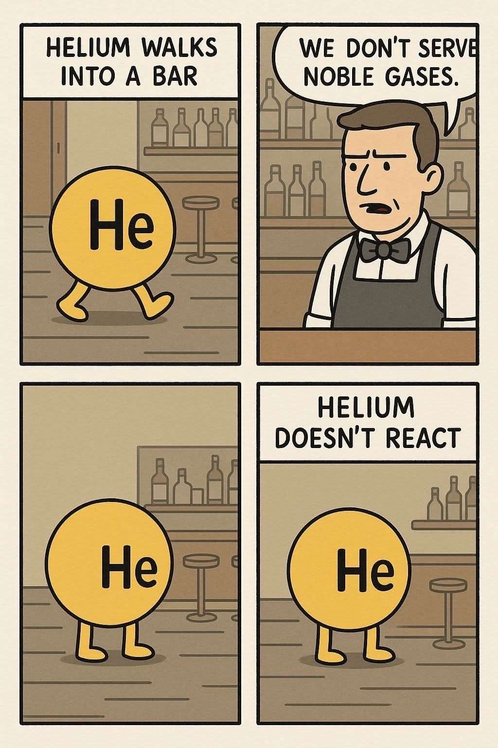
The inconsistent backround,
the cutoff text in the second panel,
that every panel is slightly different but featuring the same content(for example the “He” on helium is very slightly different in every panel, a regular artist would copy paste the text, not draw it every frame),
the font not being consistent(Look at the “E” in “HELIUM WALKS” and then the “E” in “WE DON’T”),
the absence of period symbols(Image Generation LLMs love to do this)
and the artstyle is very specific to other AI comics that are currently floating around the net.
Also, the off-white color used. AI HATES using pure white backgrounds for comics for some reason.
On top of everything others have said, there’s no watermark, signature, url, etc from an original artist. Webcomics like this will always have one unless it’s removed by a reposter, which yeah, that happens, but I feel not as often these days. And when it does, it’s a pretty shitty thing to do, and not a good situation either.
Another thing not mentioned is how when you zoom in on solid colors you see compression artefacts. Generative AI hates solid colors and sharp lines, so they often have slight imperfections
LOL thanks I don’t know that, it’s pretty obvious when I zoom in
Assuming you’re asking in earnest:
On a surface level, the banal averageness of features. There is no artist’s style — it’s just drawn in form of the “generic web comic” genre.
On a closer level, there are inconsistencies with background details that wouldn’t occur with an actual artist’s work. If somebody was manually drawing the background digitally, they would likely copy and paste the assets to both be consistent and to work efficiently (without a compromise to the work itself). The door and shelf of bottles behind the Helium change between frames, for example. If an artist were drawing this with physical pen and paper, they would care enough to meticulously recreate the bottles between frames if they were even going to include them with that much detail at all.
The text itself is also revealing. Not only is it inconsistent in size, boldness, and centering (ex. from one He to another), but the words spoken by the bartender are running out of space in the speechbubble. Artists can make mistakes like this in their publications, but consistently making errors that a quick lookover would catch shows that the “creator” of the content just wants it made, rather than it made well.
the font, all ChatGPT produced “memes” use the same “font”
Inconsistent bsckground shelving