Hey Dungeoneers, I’m still releasing patches for v3.2, and as a rare surprise, this one’s big enough to get a little blog post!
In this blog post I’m going to go over what I’ve been doing in v3.2’s patches, and what’s coming in v3.2.4 in particular!
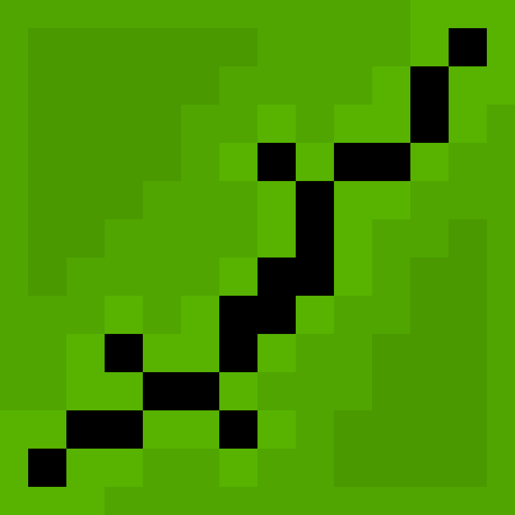
The new title screen background looks so cool.
The new title screen looks gorgeous
Is it all randomly generated? I could not find a loop at all
If so that’s perfect for a game like this where everything is just random every game
It is in fact randomly generated! of course there are some controls on it behind the scenes, which I expect will get a little more polish over the next couple patches.
To be honest, the new title screen gives me a headache if I look at it for too long. Is there any toggle available to change it back to the old way that it looked? Or could such a toggle be implemented?
Sorry but no I generally don’t put in toggles to revert changes made by updates. I am paying attention to the quantity of motion-sickness related feedback though.
Dang I was really hoping for the hp and floor/challenge info text to be bigger and more consistent with the size used everywhere else. I like the new exp bar design though.
I hope feedback about specific phone issues is OK here:
I’m on a Pixel 9 pro fold, and while folded (so on the “normally” sized screen), the display does not extend all the way to the top, even with the Full Screen option ticked.
I’ve attached a screenshot to illustrate:

(And for some mysterious reason, the setting works perfectly fine unfolded)
Hey, quick update to this, I’ve just released a new v3.2.4 to beta and it should now render in fullscreen on your cover display, and better handle the cutout both on the cover and full screen. Let me know how that works for you please.
Thanks for letting me know, Pixel devices do seem to over-report the size of their display cutouts. Interestingly this doesn’t happen in the Android emulator though. Have you made any customizaitons to your display scaling in your device’s settings?
@00_Evan
For me, the only difference between Fullscreen on/off seems to be that when off, the Android navigation bar appears at the bottom. On top nothing changes. Which is a pity, I preferred the black bar, so the game elements are fully visible. My phone has rounded display edges and a camera on top center which now obscures part of the health bar. (Fairphone 4, Android 13, SPD v3.2.4)At the moment the fullscreen setting only controls the navigation bar (I’ll likely rename it for phone users). I am actively considering usability issues caused by this change though, and devices with teardrop notches like yours are the biggest culprits so far.
@00_Evan
With the teardrop camera it is ok as only the high health part is a bit obscured.
It’s probably just me being old-fashioned that I don’t like cramming everything in the edges when today’s displays are more than twice high as wide. I think there’s plenty of room on top and sacrificing a few dozen pixels for a neat rectangular display is completely ok. Or even leaving the phone status bar visible.Sorry to hear the change isn’t working completely for you. It also looks like your device is slightly under-reporting the size of its cutout. This is tricky for the game to handle as other devices (Pixels are a big culprit) over-report the size of their cutout, so making the game give adequate space for one will mean it gives a huge amount of space for others.
I’m afraid I don’t intend to put the black bar back. I agree modern mobile screens are quite tall but I think it’s reasonable that the game should use the entire screen.
It’s similar on my phone (Motorola moto g42) in the way that fullscreen off affects only the bottom part of the display. No issues with cutouts though. (only that I have shattered the most upper part of my display, and I am unable to decipher my HP with the current fullscreen on or off. But that’s on me I guess 😆)
As your device has a hole punch cutout, could you explain to me how it’s blocking your HP bar? This is a genuine question, I am trying to gather info about usability issues with the new UI. The HP bar might be getting partly obscured, but no part of the bar should be fully hidden (at least some of it should be above the cutout), and there is also the HP text to the left.
As I was saying, the part with the HP obscured is a me problem - with shattered glass at the top of my screen. My point was that it would be nice to add the black rectangle on top, when the fullscreen is turned off.
I’ve actually just released a new version of v2.3.4 to beta that tries to more intelligently handle cutouts when it comes to the HP bar. I’m afraid there’s not much I can do about your display being physically cracked, but cutouts should no longer block parts of the HP bar.
Love the new title screen, hate the increased screen utilization. I am getting annoyed at the rounded corners and the camera pinhole right in the face of the hero. I could still play in landscape mode though.
I guess I’ll try to find my next phone to have a perfectly rectangular screen with no cutouts.
I’ve gotten a few reports from users with top-right hole punches having this issue. Sadly they all came after the beta so I’m not able to release a fix immediately. The plan is for the game to scoot over the hero status pane if there’s room to do so, so that the hole punch does not cut it off as severely.
Good luck finding a device without a hole punch unfortunately, they hardly seem to exist =S. Part of the reason I’m making this change is as a concession that hole punches aren’t going anywhere, and that it’s better to accept and try to design around them.
Thank you for fixing the character portrait in the latest release.
Thank you for looking into that. Meanwhile I dug out my old tablet and it still works. I do not think one more Android 5.1.1 device in your usage stats will surprise you too much. Apparently there are still players on the 4.x that you had to drop.
But if you see a sudden surge in old versions, that could be people like me - enjoying a big rectangular screen with no occlusions once again.


