

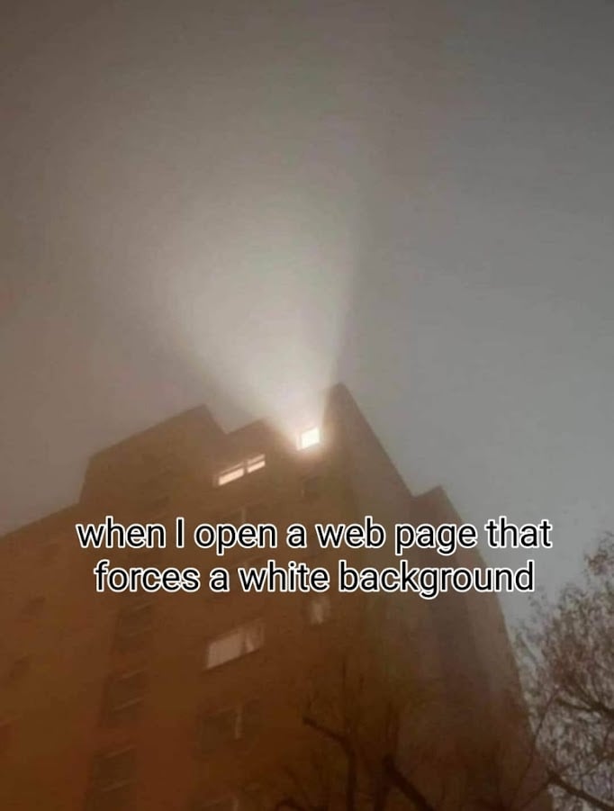
A photo looking up at a residential building at least 6 stories tall. It is night time, and the vast majority of windows are dark. The windows of one residence are slightly lit. Then, the window of another residence has a light that is extremely bright blaring out of it. The caption reads, “When I open a web page that forces a white background.”
Feel the picture. Generally, I agree with most said so far, prefer Darkmode most the time as well and I‘m also happy there are more and more options to choose from lately. Also screen brightness turned down, blue light filters etc., sometimes even change in color saturation, hide gifs and so on. Which definitely kills the overall experience, it just needs to be done if it gets too much.
But due to Astigmatism I realized reading texts in Lightmode or unusual/unpopular color themes seem easier to the eyes, even more so when reading/writing longer texts (or simpler tasks such as scrolling through posts, figuring out how to word an Email for an hour), as well as working a lot on PC. Unfortunately there‘s just very few sites, themes or settings that do it for me concerning the font/color/brightness combo.
edit:wording.