
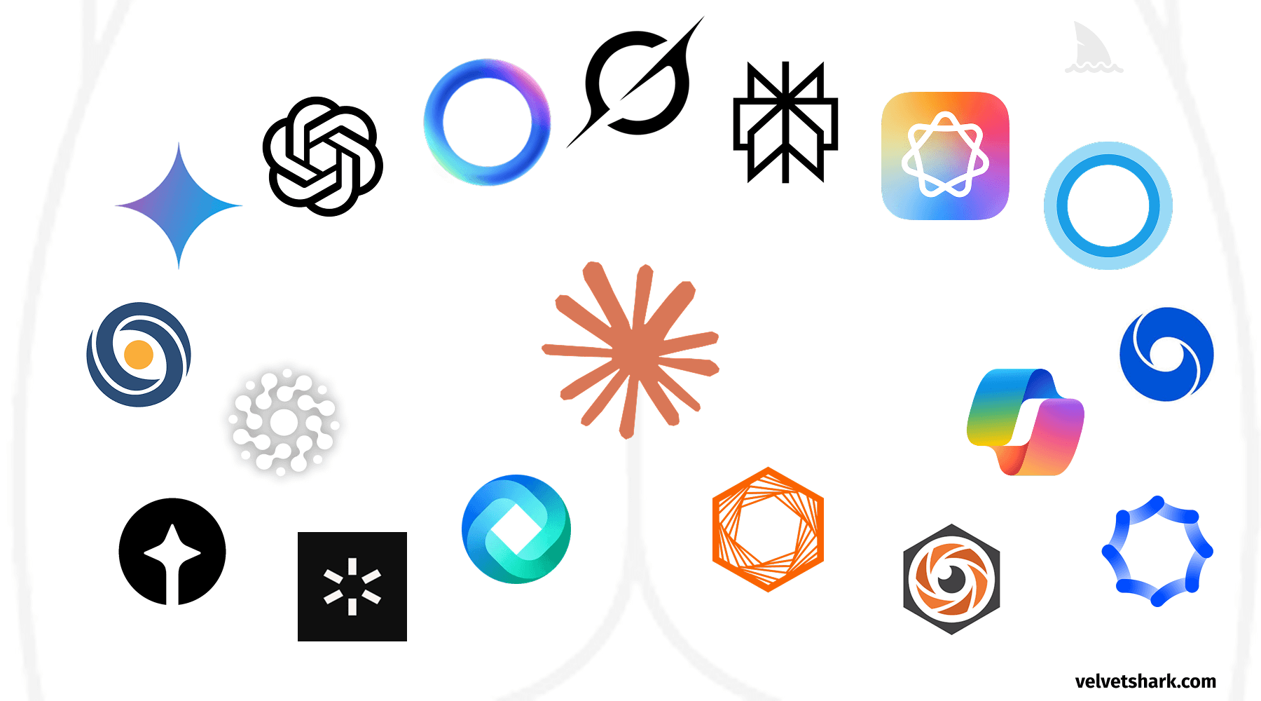
A humorous exploration of the uncanny resemblance between AI company logos and human anatomy. Discover why circular, gradient-based designs dominate the AI industry, and what this design convergence tells us about branding in tech.
You must log in or # to comment.
“[…] The design embodies the fluidity and warmth of human-centered thinking through the use of circles, while right angles introduce the precision and structure that technology demands.”
Bro, what? A black-and-white logo to represent the warmth of human-centered thinking? And I’m not seeing a single right angle in that entire logo…